A server behavior is a reusable component for server-side development.
They add blocks of code to your pages for accomplishing specific tasks.
Dreamweaver comes with several default server behaviors and the InterAKT
extensions add many more to this list.
A database refers to data organized and stored on a computer that can
be searched and retrieved by a computer program. Most industrial-strength
and many smaller database applications can be addressed using SQL (Structured
Query
Language).
A query is a SQL command that will extract information from the tables
of a database. Essentially, a query is a request for information from
your database.
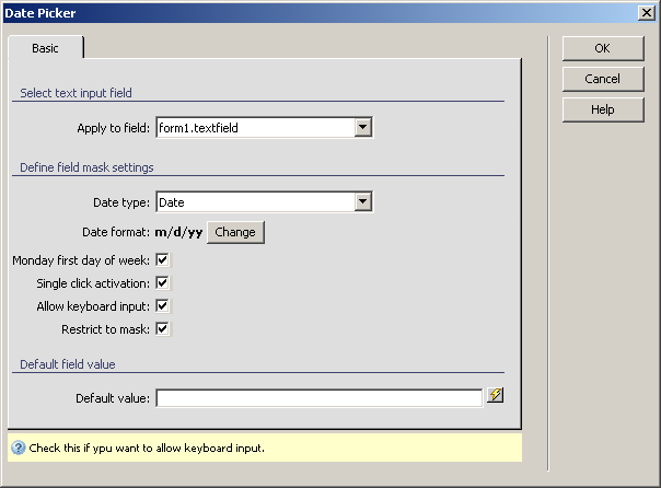
Configure Date Picker
The Date Pickerserver
behavior
allows the web developers to include a date picker text field in their
site pages. Before applying it, there must be a text field added in the Dreamweaver page.
This server behavior is accessible from the Application
panel, Server Behaviors -> + -> MX Kollection
-> Form Controls -> Date Picker.
The user interface has only one tab. Directions about its correct configuration
are given below.
To set the dialog box options, follow the next steps:
In the Apply
to field drop-down menu select the text field on which to
apply the server behavior.
In the Date type drop-down
menu select one of the two options:
· Date
- if you want displayed on the date (day, month, year).
· Datetime
- if you want displayed the date and the time (day, month, year, hour,
minute, second, am/pm).
The Date format used
in your site is displayed in bold text. You can change it by clicking
on the button next to it, Change. For more
details, read Date formats.
Note: If the entered information is to be inserted in your database,
select the date format that is compatible with the table field that stores
the date-type data.
The Monday
first day of the week checkbox makes Monday appear as the
first day of the week in the calendar. If unchecked, Sunday will appear
as the first day.
The Single
click activation checkbox will insert the clicked calendar
date in the text box and then close the calendar. If unchecked, the calendar
will be closed by the user (either by clicking the "x" icon,
or by clicking somewhere else in the page).
The Allow
keyboard input checkbox allows you to manually enter the
date in the text field, and not only select it from the calendar.
The Restrict to mask
checkbox limits the number of characters typed to the mask length.
In the Default
value text box enter a starting value for the date picker
text field. You can also select it from one of the available recordsets
in your page by using the lightning icon on the right.
The three buttons on the right of the interface offer
you the next functionalities:
· Click OK when you are done configuring the server behavior.
· Click Cancel to exit without applying the new settings.
· The Help button opens this help page.