The Row Properties panel is displayed when
you select at least two cells on the same table row, when you click the
associated glyph (the selector symbol), or when the <TR>
tag is selected in the Tag Selector:
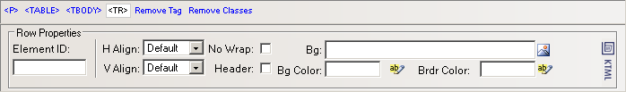
To configure this panel, follow the instructions below:
In the Element ID text box enter the value for the id attribute. It will uniquely identify the element (table row) in page.
The H Align drop-down menu contains the options for the horizontal alignment of the row's content:
Default
Left
Right
Center
The V Align drop-down menu contains the options for the vertical alignment of the row's content:
Default
Top
Bottom
Baseline
Middle
If the No Wrap option is checked, each paragraph in the current row will be displayed on a single line.
If the Header option is checked, the content from the current row will be formatted as bold and centered (header style).
With the Bg text box
you can set an image as the row background. You can either enter the full
path (URL) to the image previously uploaded on the remote server or you
can click the Browse for Image button to select
an image from the server:
Note: It is your task to make sure the image has appropriate
dimensions, as automatic resizing of the image to the row's dimensions
will not take place.
With the Bg Color text
box you can set the desired background color for the selected row. You
can enter the hexadecimal code of the color in the text box or you can
click the Color
Picker button:
With the Brdr Color
text box you can set the desired border color for the selected row. You
can enter the hexadecimal code of the color in the text box or you can
click the Color
Picker button.

Note: Each cell of the selected row is bordered in that color,
and not only the table row (seen as a larger cell).